Back in Episode 47 we maligned USA TODAY’s design of the front page in the Mighty Ducks when they had Russ on the cover. Kevin promised to redesign it. He did.
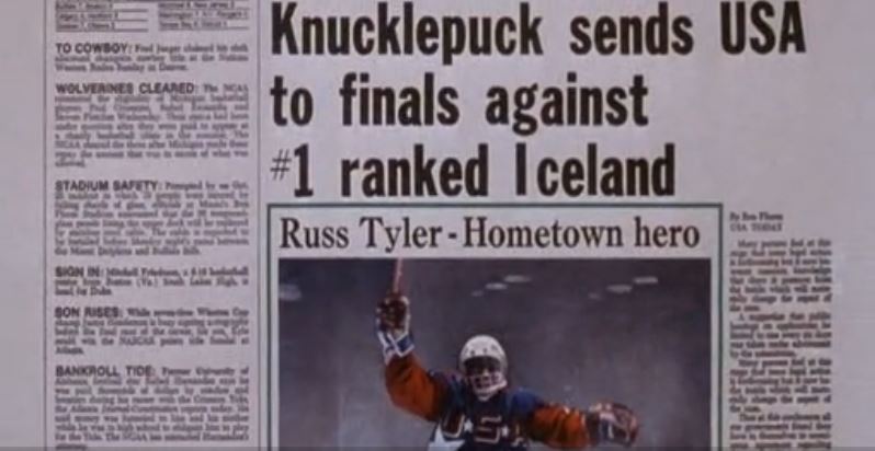
First, here is the original USA Today design for the Mighty Ducks’ win to send them into the finals:
The headline is three lines and awful. There is a bunch of whitespace to the right side. Even the spacing on the headline is weird, with the ‘I’ in Iceland sticking out on its own. The right-side article either has no headline or is supposed to accompany the hero image, but the hero image has a weird box that separates it and a second headline, we guess.
It’s a mess.
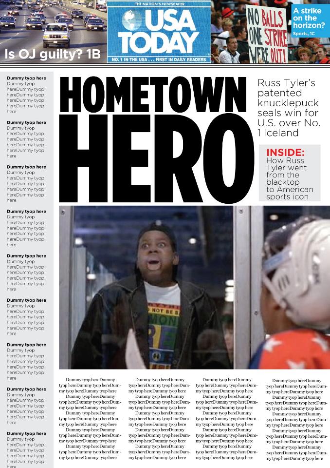
Kevin, who used to design newspapers for a living and still works as a designer, puts forth a better effort here, giving Russ Tyler the type of hero-worship he deserves.
Extra points to Kevin for borrowing from USA TODAY‘s print logo from that time.
The white space is gone. We have a clear image and a clear headline. The subheadline adds context, and we even get a little teaser box. It’s just cleaner and easier to read. The photo of Russ isn’t the greatest considering its from when he was in the crowd the week before and not him winning the game with his knucklepuck, but Kevin can only work with what he’s got. All he had were some screenshots and whatever Google could provide. The image in the original was cut off and blurry so it couldn’t be reused.
The only minor nitpick I have beyond that is Kevin made a mistake. Russ Tyler’s knucklepuck did not seal the win for Team USA over No. 1 Iceland. It won the semi-final game that set up the winner-take-all showdown with Iceland in the Junior Goodwill Games final.
Overall though, Kevin earns a duck call.
