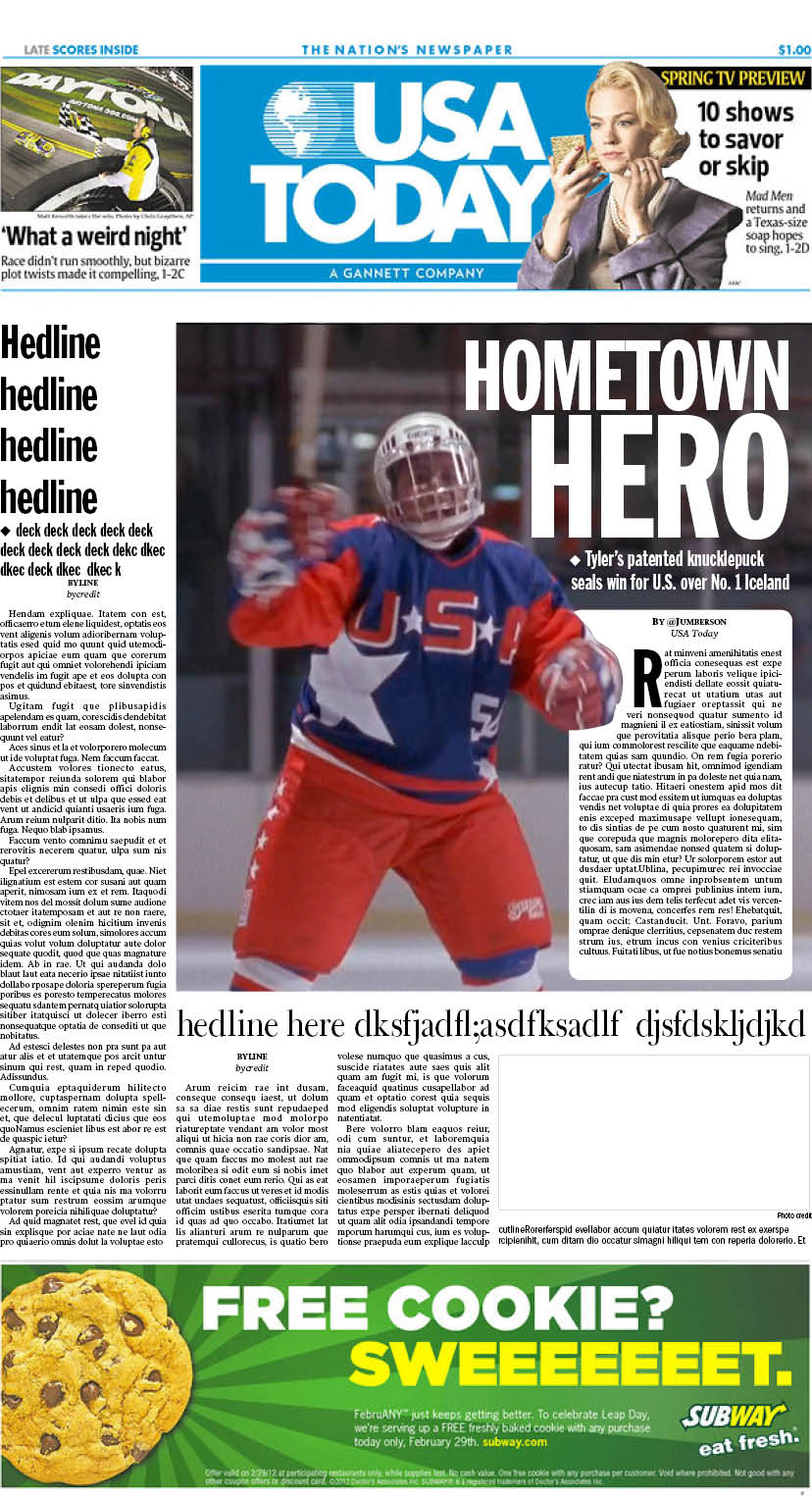
Back in Episode 47, we broke down how terribly designed the Mighty Ducks’ USA TODAY cover, featuring Russ Tyler, was. Kevin since redesigned it, but this week on Twitter, Quackolyte Justin Umberson accepted the challenge and designed his own front page.
Justin’s front page might be even better than Kevin’s.
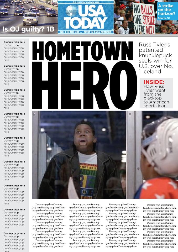
For reference, here is Kevin’s front page:
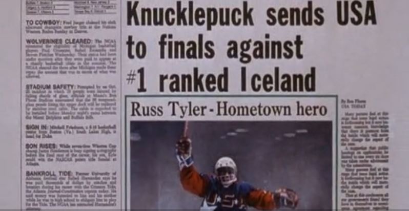
And the original front page:
Gone is the white space, and the weird box and double headline.
Think you can do better? Design one and send it to us at quackattackpod@gmail.com or on Twitter @quackattackpod
We broke down the media coverage of the Mighty Ducks way back in Episode 5. Let’s Play Hockey was the major driver of coverage in D1, while USA TODAY was the major driver of coverage in D2. Let’s Play Hockey had fake articles that were oddly compelling and was chock full of information.
Through Let’s Play Hockey we learned that the Mighty Ducks vs. Hawks championship game was the Tier II state tournament, and that the Hawks won their semifinal game 4-1. It also taught us that the Jets were their archrival.
USA TODAY just had a bunch of filler text sandwiched around pictures of the Mighty Ducks and the Junior Goodwill Games.
For example, the only information we have that the USA beat Canada was in the paper. This is the beginning article that went along with the picture of the Bash Brothers:
“A suggestion that public hearings on applications be limited to one every six days was taken under advisement by the commission. Future plans ….”
The corresponding article talking about Iceland’s loss to Russia begins:
“Thus at this conference all…Many persons feel at [sic] this is forthcoming but it now becomes common knowledge that there is pressure from the inside…”
It’s all nonsense.
At least we gave them a better newspaper design.


